DANISH TEAK CLASSICS
USER RESEARCH | UX DESIGN | UI DESIGN
Danish Teak Classics is a vintage, Danish modern furniture showroom that also offers restoration and interior design services.
Problem
The website is outdated. The homepage fails to capture the scope of the business, product browsing pages lack filtering options and prices, and CTAs are understated.
Goals
Update DTC's website so it follows modern UI/UX best practices and delivers what consumers look for/expect in a furniture store's site.
RESEARCH
Objectives
Understand how shoppers browse for vintage furniture
Understand what information shoppers consume before making a vintage furniture purchase
Understand what information shoppers expect to find on a retailer's homepage
Methods
Competitor Analysis — I compared DTC’s website with two local competitors — Golden Age Design and FindFurnish — and one out of state competitor — Midcentury Mobler — in a similarly sized market.
Interviews — I interviewed two vintage furniture enthusiasts and two current employees of DTC. One of the employees is an interior designer and the other is a buyer.
Findings
Homepage should contain key business information
Hours, location, and social media links are expected. Imagery that conveys the type of inventory helps shoppers determine if it’s worth looking further.
Filters and suggested pieces are helpful
Filters are mostly used for size, material, and cost; filtering by designer was less important. “You might also like” suggestions are appreciated.
Shipping info can drive decision making
Shipping information (mostly cost) is important, especially for designers who tend to source more broadly, A clear way to contact the retailer is helpful for follow up questions.
Personas
From the interviews, I developed two personas to capture different types of DTC shoppers -- an enthusiast and a designer. These personas served as filters for my solutions during the design phase.


IDEATION
Solutions
Update Homepage
Povide a clear sense of products, services, and showroom information
Update Browsing Pages
Include more robust product cards and sorting/filtering options
Update Product Pages
Make CTAs on product pages more clear: "add to cart," "get a shipping quote," "ask a question."
Site Map
Designers, collectors, and general shoppers often compare pieces from multiple retailers. Therefore, the site map — sorted into Products, Services, About, and Cart — kept the experience of shopping for furniture/design services aligned with what users would expect. Additionally, the updated site map is quite similar to the current design, except for a few pieces of content consolidated within "About."

User Flows
Various user flows helped me ensure the design didn't present any hurdles to accessing desired information, especially when compared to other vintage furniture websites.

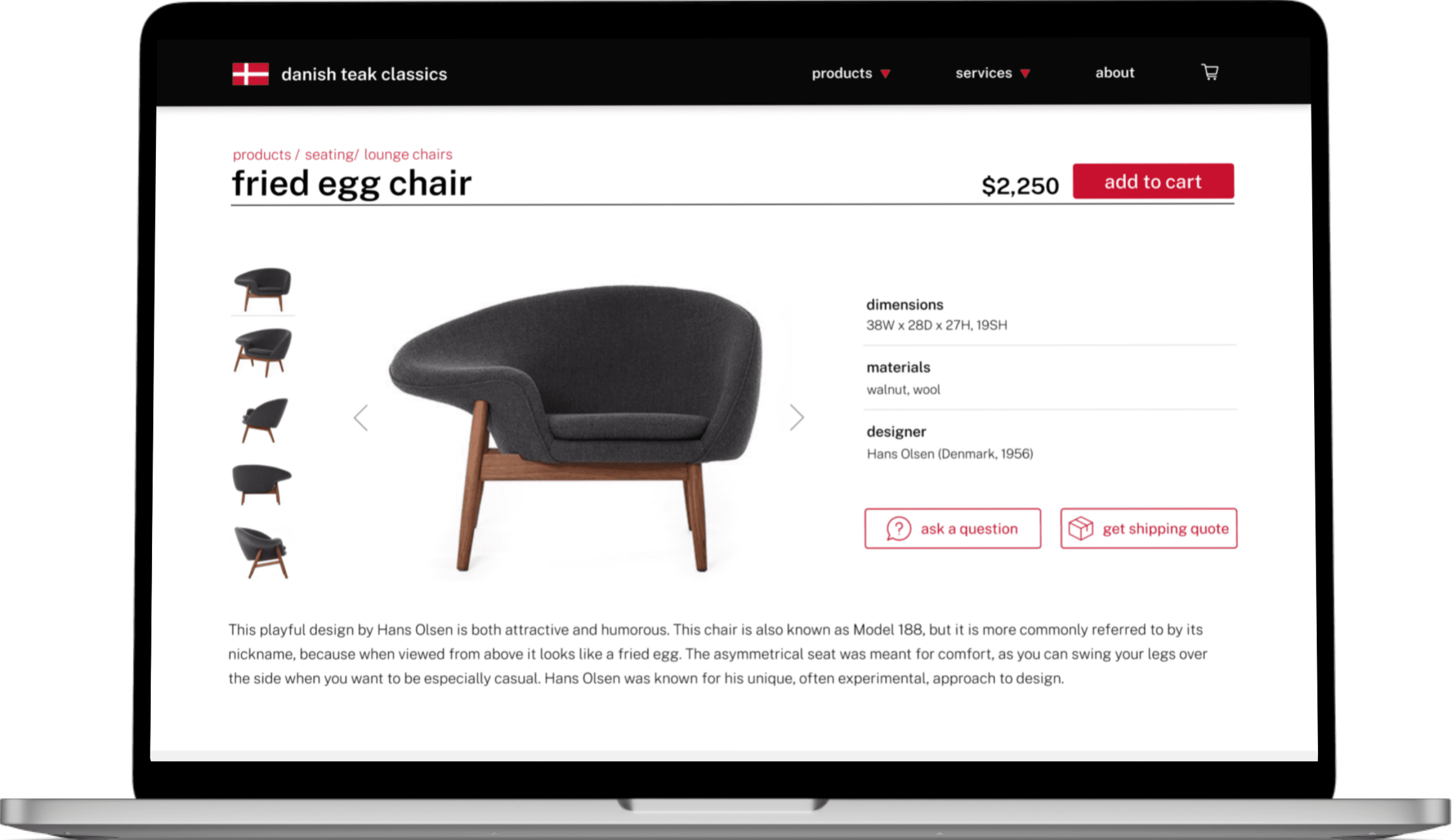
User Flow 1: Add a Fried Egg Lounge chair to your shopping cart.

User Flow 2: Select your favorite interior design portfolio project.

User Flow 3: Add local delivery as a shipping option for the items in your cart.

Sketches + Wireframes
I began the wireframing process by sketching ideas that addressed the proposed solutions. Moving from pencil and paper to Figma allowed me to begin developing key, repeatable elements — buttons, product cards, etc. — that would help achieve visual consistency across the site's design.


DESIGN
Visual Identity
DTC has an existing visual identity that I mostly worked within for purposes of brand continuity.
I updated the font to Public Sans, which offers a greater variety of weights.
I designed clear CTAs to help users navigate the site more swiftly.
I adding a several shades of gray to the color scheme to create a more robust palette.

Component Library
After establishing the visual identity of the product, I began updating the wireframes and building a component set for repeated elements. I used red for clickable elements (arrows, CTAs, etc.), to bring attention to components in the original site that were more easily overlooked.

UPDATED UI
Homepage
The new homepage opens with a singular hero image, text that describes the business, and a CTA to help visitors understand what the business does and how to proceed. The middle sections include an overview of the services provided and an introduction to The Lake House, brining to light information that users would have easily overlooked. The page concludes with a link to DTC's Instagram and a footer with hours and location to align with UI best practices.
Browsing
Browsing for furniture is made easier with prices included in the product cards as well as sorting/filtering options, which allow users (particularly those searching with a specific product in mind) to sort the content by how recently the products were added, price points, materials, etc.
Product Page
Unlike the existing site, the new product page contains all the photos within the landing frame. Additionally, there are clearer CTAs for adding a product to the cart, asking a question, or requesting a shipping quote. "You might also like" was included to lead customers to other options, rather than make them search for alternatives.
OUTCOMES
Testing + Findings
Overall, users navigated the site with relative ease — likely aided by the fact that many retail sites employ a similar UI. However, there was room for improvement.
The product cards had a red shadow that appeared more pink in the hover state. I changed the shadow to black to remain more consistent with the color scheme.

Original

Update
The services listed on the interior design page were randomized, which made it difficult for users to find what they were looking for. Therefore I alphabetized them to expedite the search process.

Original

Update
The breadcrumbs at the top of the product browsing pages were updated from black to red to indicate their status as clickable (as is the case with the rest of the clickable elements on the site).

Original

Update
The "totals" section of the shopping cart was updated to emphasize the price (rather than the category) and the spacing between the elements was tightened to reduce awkward white space.

Original

Update
Conclusions + Future Considerations
I believe the updates made to the UI of the site (particularly to align it with more contemporary norms) made this project a success. Specifically, the CTAs are more clear and the content on the homepage better informs users of the various facets of the business, beyond selling vintage furnishings.
During this project, my understanding of scalable components started to solidify. Using a 12 column responsive grid helped me scale the design up and down to fit various screens. Additionally, building a responsive site forced me to better master sizing options such as fix, fill, fit, etc., especially when it came to repeated elements such as the product cards.
If I were to continue with this project, I would to push the UI further to include more dynamic content (especially on the homepage). Additionally, I would like to further investigate ways to more creatively connect the UI to midcentury graphic design motifs specifically via spacing, fonts, and boarders.


